Pretty / Dapper
Brand Identity
Client: Pretty Dapper
Industry: Haircare, Service
Working closely with shop owner Sean Lathe, I created a brand identity for his Manhattan barber shop. Sean’s vision for Pretty / Dapper was to create a space where all felt welcome to embrace their most authentic self. Primarily serving the LGBTQ community in Hell’s Kitchen, the name Pretty / Dapper plays with both the masculine and the feminine, inviting customers to express themselves anywhere along that gender spectrum; whether through a fade or a blowout.
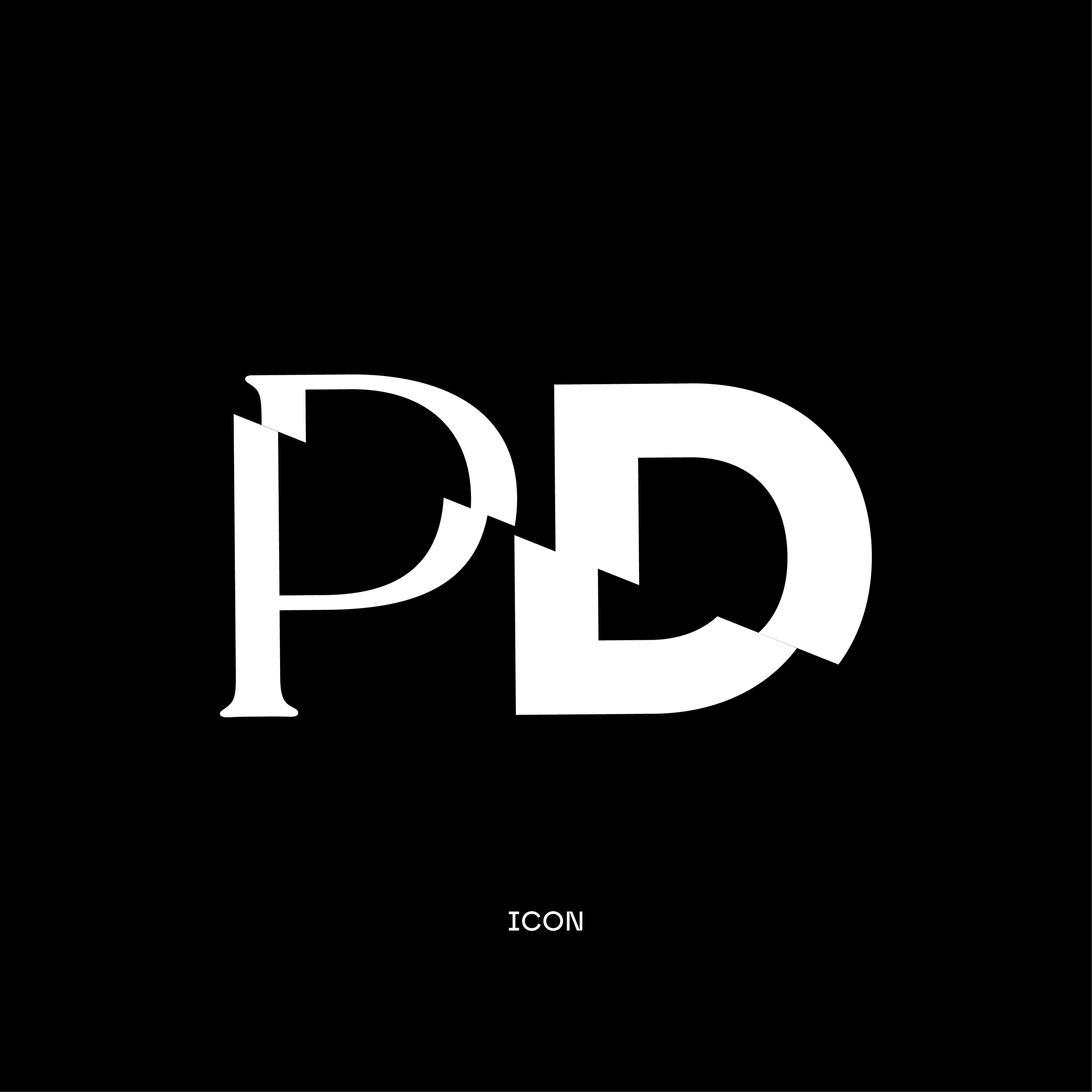
The visual language of the brand draws inspiration from this mission. Combining black & white imagery with pops of vibrant, pink color. The logotype utilizes a classic serif font with a sans serif to communicate this duality.
The “cut” icon draws inspiration from the classic barbers pole and this visual metaphor is extended in the image treatments/crops throughout the website and printed materials.
The supporting typography “Safiro Pro” draws inspiration from the sharp lines of the icon.